How long does a one-click purchase really take?
One-click purchase is the holy grail for sellers — but for customers, is it really about a single click, or more about an effortless journey? Gain insights from our experience creating a flow that works for both customer and business.
One-click purchase sounds like the holy grail of digital user experience. One click and you’re done. Fast, elegant, effortless. Like magic.
But if you’ve ever actually tried buying something online (or worse, designing how that works), you know reality rarely lives up to that fantasy.
- The customer wants speed and simplicity
- The seller wants to increase conversion rates and reduce abandoned baskets
- And the Product Owner? They’re walking a tightrope between those two worlds, skillfully balancing like an acrobat in heels
In this blog, I’ll share how, while developing a digital shop, we designed a purchase flow that feels like one-click to the customer, but under the surface, hides carefully balanced steps, rules, and decisions.
What do customers actually mean when they say, “I want to buy now”?
They don’t literally mean one click. What they really want is the feeling of simplicity. From our experience, it looks like this:
“I don’t want to fill out yet another registration form.”
“Don’t ask me for 15 input fields if you already know who I am.”
“If the price is €14.55, I want to be charged exactly that.”
“If I’m buying a physical product, just give me one simple shipping address field and we’re done.”
In short, the customer doesn’t want us to get in their way. But how do you turn that into a purchase flow that actually works—for both the customer and the business?
This brings us to the question we’ve all asked ourselves at some point: how long does a one-click purchase really take?
In theory? One click.
In practice? A series of micro-decisions we’ve already made for the customer.
They’re not asking for one click; they’re asking for a path with nothing in the way. Clear, fast, seamless.
One-click isn’t the goal. One-click is a feeling.
So, what was our game plan?
That exact feeling guided us while designing our digital shop. Customers expect simplicity, but behind the scenes, we still need to balance:
- Technical limitations (we can’t magically teleport products)
- Legal requirements (we love rules, but not ones that slow us down)
- Business goals (because, yes, we do still need to make money)
On top of that, we had to consider three main user scenarios:
- Returning customers – they’re logged in, we know them, and they’ve shopped with us before (we know what they did last summer)
- Guests – first-timers who don’t want to create an account (yet)
- New customers – they’re ready to register upfront or during checkout
And all three groups expect the same thing: don’t complicate things if you already know what they want. Sounds fun, right?
One-click, almost-click, and everything in between
We had three different scenarios but one goal: make everything feel like one smooth, fast click. That’s how we came up with one-click, almost-click, and everything in between.
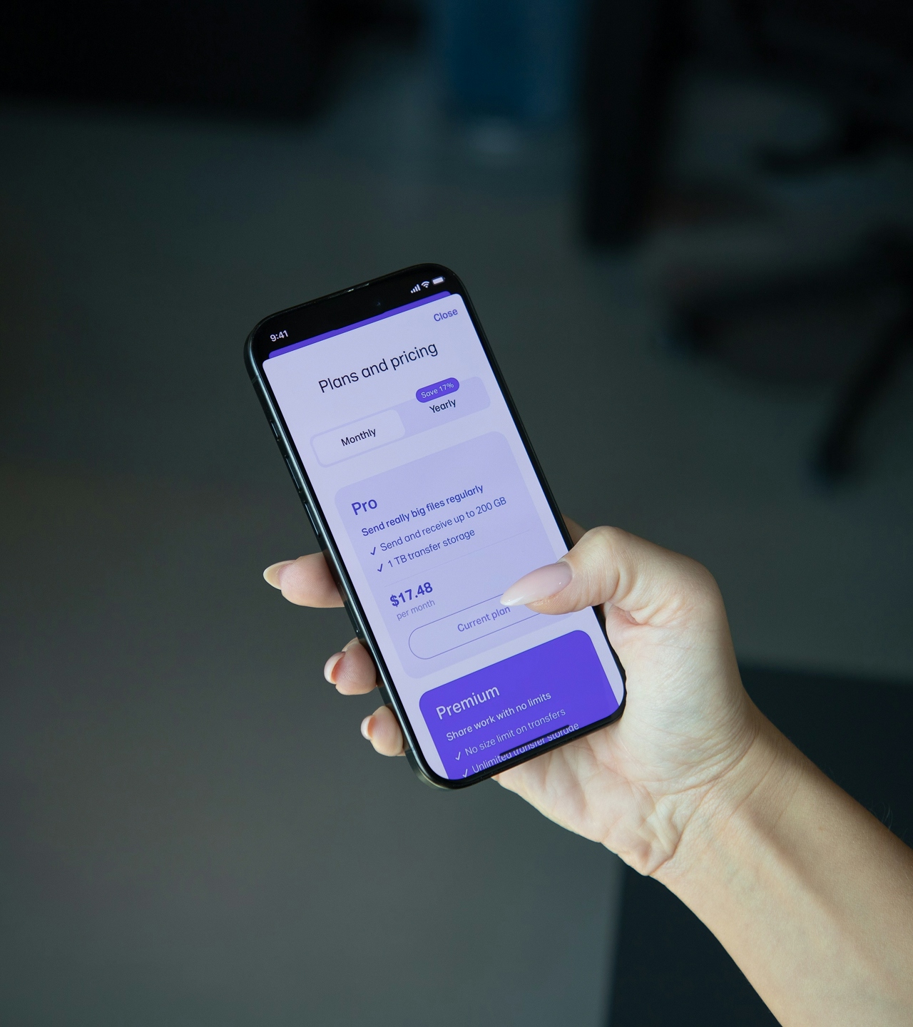
For logged-in customers, we already have everything: address, payment method, and accepted terms. Their purchase is literally two clicks: Add to cart → Confirm purchase.
That’s a true one-click experience. And honestly, it’s the easiest part to design because we already have the context.
For guests who don’t want to register, we built a minimal checkout:
- Only the essentials: name, address, email, card
- No registration
- All on one page
- No redirects or detours
Is it technically one-click? No. But it feels close. Most importantly: no friction right at the moment they’re ready to buy.
For those who decide to register, we made it quick with just the basics. For guests, registration comes only after purchase—and it’s optional. When satisfaction knocks, registration is just another invitation for coffee.
What we focused on most
When you start designing something that has to look simple from the outside, you quickly realize that every “invisible decision” is critical. It’s not about the number of clicks—it’s what happens before them. We anchored everything around these principles:
- Info before input – Customers need to see right away what they’re buying and at what price, without having to play detective like Sherlock Holmes. That’s why all the essential details are displayed upfront, directly on the screen. No digging around the page needed.
- Availability upfront – No point asking for details if it’s out of stock. If it’s unavailable, we say so immediately and offer a “notify me” option instead.
- Clear pricing and benefits – No tricks, live updates, transparency all the way.
- Subtle cross-sell – Nobody likes a pushy salesperson. Our approach: gentle nudges, not loud popups.
- Guest checkout that doesn’t feel like a guest – Fast, clean, one-page checkout with only essentials. After purchase, we invite them to register in one click—because by then, we’ve already earned trust.
How long does our one-click really take?
- Logged-in customer: under 1 minute
- Guest who knows what they want: 1–2 minutes
- New customer creating an account: 2–3 minutes
Ultimately, there’s only one metric that matters: “That was quick and easy.”
We didn’t just simplify the flow. We simplified the experience. And that’s the difference customers don’t see, but they feel.
How do you give customers freedom and get results?
Designing a “fast purchase” isn’t just about shrinking checkout, slapping on a “Buy Now” button, and hoping for the best.
It’s about removing friction and amplifying ease:
- We gave customers a choice, rather than forcing them into one rigid path.
- We only asked for what was absolutely necessary, not a letter more.
- We surfaced all the key info upfront, no digging required.
- We left space for the relationship to continue if they chose to return.
The result? New customers buy more easily because nothing feels like an obstacle. Existing customers buy faster because everything’s already familiar. And behind the scenes, we build the foundation for a relationship that doesn’t end at “Order confirmed.”
How does it look, in practice? Guest customers can make impulse purchases without registering. Logged-in customers confirm orders in two clicks. Everyone else? Flexible options to log in, register, or simply buy as they are.
And after purchase? We already have what we need to offer value. But we don’t push. We don’t force trust—we earn it. We show that we can make things easier. And then they choose to stay.
Click isn’t the end of the story
In digital sales, the magic isn’t in the single click. It’s in the invisible harmony between customer desires and business realities. When we hit that balance, buying stops being a chore and becomes a genuinely enjoyable experience.
Our focus wasn’t just on simplifying one step. It was building an entire system that works for the customer, not against them. That’s the path to long-term trust and lasting relationships.
Ultimately, the sale is just the first step — the lasting impact comes from the experience.
Hey, you! What do you think?
They say knowledge has power only if you pass it on - we hope our blog post gave you valuable insight.
If you want to share your opinion, feel free to contact us.
We'd love to hear what you have to say!