HIVE: visual identity proposal for an accelerated cloud computing platform
Challenge
By creating a new visually appealing brand look and feel, among other things, we wanted to create an opportunity for HIVE to kick start its scale-up in the competitive market of the industry. The client needed an identity design that would help increase trust among its existing and new users.
Solution
The main guideline was to refresh the existing identity so HIVE's original design has been taken as the starting point. We detected key features of the initial design and implemented them in a new identity proposal to maintain a high level of brand recognition. By doing that, we also created an opportunity to enhance the applicability of several design elements (e.g., the applicability of the logo in small file sizes).
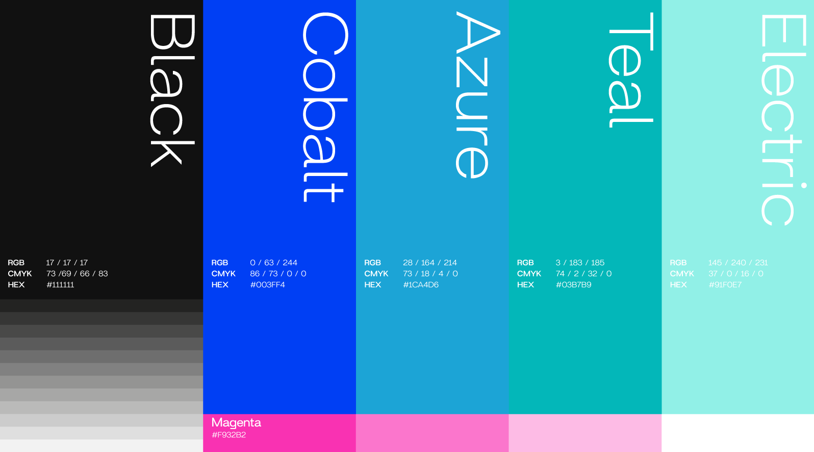
Some of the unique attributes of the existing design that have been kept to preserve the HIVE's distinctiveness are overlapping hexagons forming a bee, a soft look and feel, and a color palette inspired by the Aurora Borealis.
New logos for each sub-brand created using parallelogram combinations enhanced the relationship between HIVE brands and strengthened the brand architecture.
This enables the client to communicate his message more clearly to the intended audience of a particular sub-brand.
Result
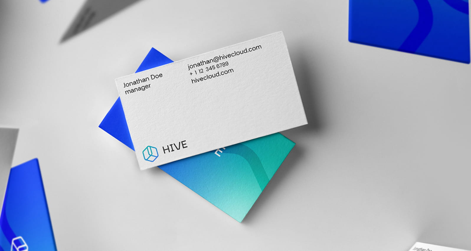
The final outcome is a simplified version of the existing HIVE logo - a logo that preserved its distinct features but is now also technically more sound; meaning, all its unique details are legible in different dimensions and color applications.
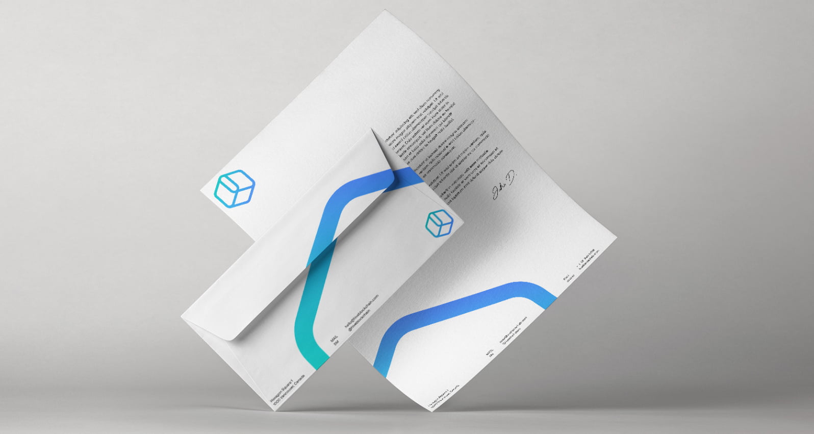
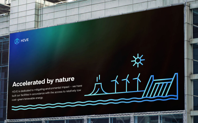
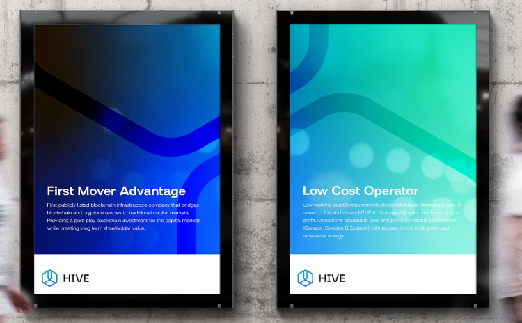
The new visual language is communicated throughout the new visual identity design - thin lines with gradients and soft edges, as well as hexagons, are being infused into every graphic element, from the logo to icons and pictograms.
The result is a new and refreshed visual identity design inspired by nature's colors that communicate HIVE's efforts to enable human progress through high-performance computing using renewable energy sources.
